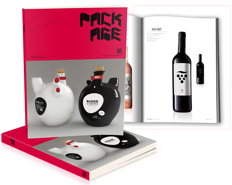
Creating a captivating design for the Aibat wine brand involves careful consideration of the logo, bottle label, package design, catalog, and other useful elements. Each one plays a crucial role in conveying the brand’s identity, establishing a strong visual presence, and enticing customers. Here’s a breakdown of the key aspects:
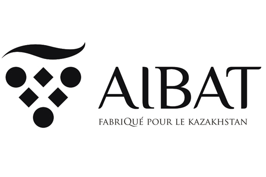
Logo: The logo for the Aibat wine brand serves as the centerpiece of the wine brand’s visual identity. It embodies the essence of the brand, reflecting its personality, values, and unique selling proposition. It’s done in a classic and elegant style, evoking a sense of sophistication and allure, instantly capturing attention and leaving a lasting impression on consumers. It reminds both Grapevine and Vertumnus, a portrait depicting Rudolf II, Holy Roman Emperor by Giuseppe Arcimboldo
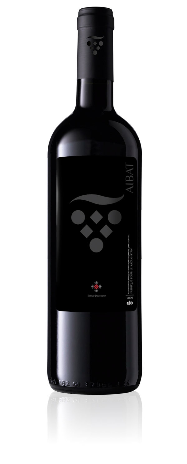
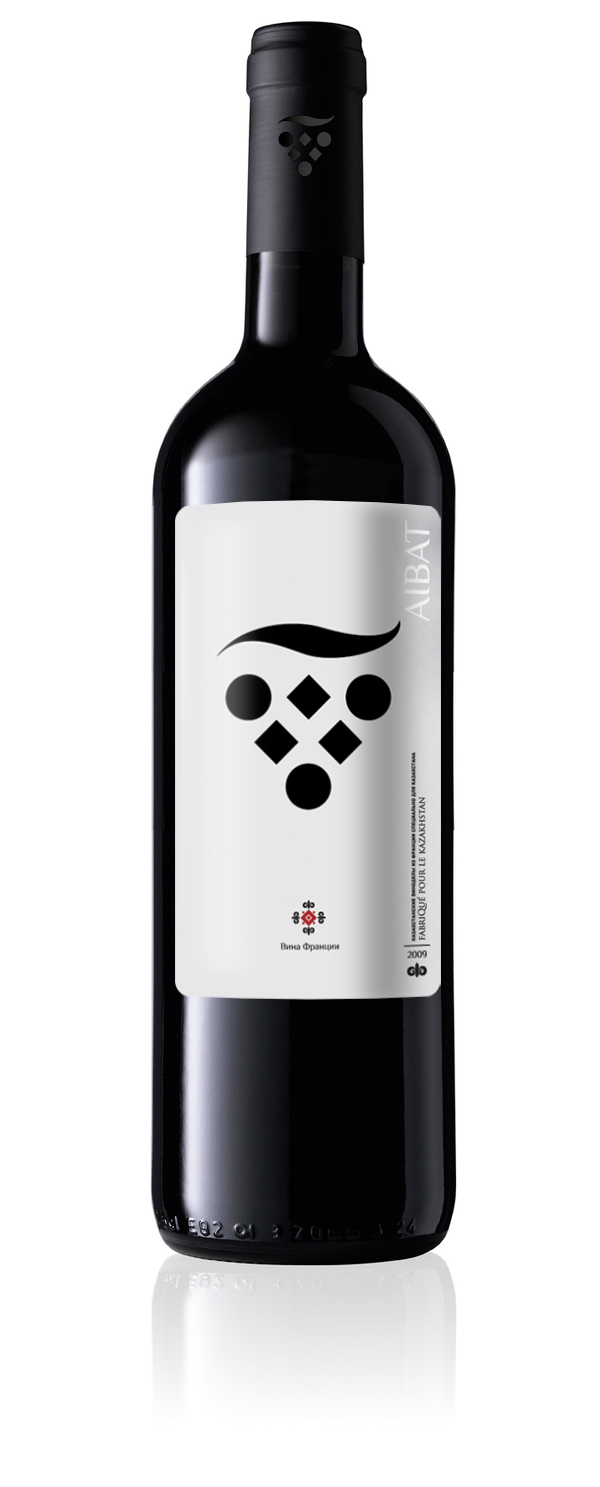
Bottle Label: The bottle label is a canvas for storytelling. It should harmoniously combine aesthetics, information, and branding. I have selected very simple yet stylish typography and a monochrome color scheme. The label should visually communicate the wine’s quality, origin, and story behind it, which clearly tells us that this is a new manufacturer with big ambitions.
Package Design: The packaging design goes beyond the label and encompasses the overall presentation of the wine bottle. It involves considering the shape, materials, and additional elements like foils, capsules, or closures. It’s a sleek and minimalist design elaborating on some luxurious concepts.
Catalog: A well-designed catalog is essential for showcasing the wine brand’s portfolio and providing detailed information about each wine offering. It features high-quality product photography, engaging descriptions, and consistent branding elements. The catalog’s layout color scheme visually appeals to the colors of wines Aibat produces – red and white wines.
